Skip to content
  1. Home
  2. My work
  3. Edupression

edupression: case study of a permanently listed DiGA for depression

One calm daily plan that helps people with depression finish
their therapy, and keeps their doctor in the loop.

Case study 01
edupression · Case study Digital health · DiGA · iOS, Android, Web
✓Daily log done
+40 BDNF drops
6tasks today
Week 1 · Day 3
Industry
Digital health01
Mental health02
DiGA03
Project type
Mobile app01
Patient portal02
Design system03
Services
Product design01
UX writing02
Accessibility03
Credentials

Listed, certified, protected.

What a prescribable therapy app has to prove before doctors can use it, and what our build was designed to pass.

DiGABfArM directory Permanently listed
A prescribable digital therapy, on the official list.

Edupression is permanently listed in the BfArM directory of digital health applications for unipolar depression. Doctors and psychotherapists in Germany prescribe it, and statutory health insurers cover the cost.

Prescription on statutory insurance Adults 18 to 65 Mild to moderate depression 59 therapy sessions
Class I
CE-marked medical device
A class I medical device that meets the EU requirements for safety, quality and performance.
Compliant
GDPR and DSGVO compliant
Health data is processed under Art. 9 GDPR (DSGVO in Germany), used only for the therapy and deleted when it ends.
Met
BSI TR-03161 security
Sign-in with the German GesundheitsID follows the federal security guideline for health apps.
MedUniWienClinical partner
Developed with the Medical University of Vienna
Efficacy tested in the eFICASY randomised controlled trial with 250 adults.
ClinicalTrials.gov · NCT04839822 ↗

Status as published in the BfArM DiGA directory, on ClinicalTrials.gov and by the manufacturer on edupression.com. Listings, certificates and study results belong to the manufacturer's product.

01 · Overview

One plan,
every patient.

edupression is a DiGA: a digital therapy for depression that doctors in Germany prescribe and health insurers pay for.

We redesigned the full patient journey, from sign-up and onboarding to daily tasks, reports and the doctor, so the therapy fits into a few calm minutes a day.

!The problem

The challenge

edupression needed a programme that people with very little energy could follow every day, while it stayed clinically valid and safe.

The challenge was to make the therapy feel light and personal, without touching the questionnaires, safety rules and DiGA requirements it rests on.

Had to flex
Task timing & order
Tone & encouragement
Theme & screen size
Had to stay
Validated questionnaires
Safety protocols
DiGA requirements
What we delivered

How we helped

We built one calm daily plan on a shared design system: reusable flows, components and theme tokens, with a safety layer every task can call on.

That made it faster to add tasks, test variants and keep every screen consistent, in light and dark, on any device.

Reusable task flows
Shared components
A/B/C-tested daily log
Light & dark tokens
Built-in safety layer
Doctor & prescription flows
Methods• Clickable prototype• A/B/C testing• WCAG audit• Data audit
02 · The outcome

What the redesign delivered.

A complete, clickable product: every patient and doctor screen and every inner step of every task, in light and dark, on phone, tablet and desktop.

58screens designed
Every flow, end to end
Log-in & sign-up · 13 Onboarding · 6 Plan & end of day · 7 Six therapy tasks · 24 Portal · 8
6
therapy tasks a day, each with its own guided flow and completion moment
3
visual directions explored and tested before committing to one
3
daily-log placements built for A/B/C testing, by time of day
AA
WCAG 2.1 contrast, names and focus checked on every screen, light and dark
A day with edupression

Morning to evening, one rhythm.

The app follows the patient’s day. The plan greets them in the morning, the daily log waits until evening, and dark mode takes over at night.

{{ di.time }}{{ di.label }}
{{ di.sub }}
{{ dayTime }}{{ dayChip }}
{{ dayChipSub }}
03 · Inside the system

Four shared layers. One calm product.

Shared by every task
01Shared
Therapy flows
Every task designed once, with every step, state and completion.
{{ fl.n }}{{ fl.label }}In progress
02Shared
Core components
Built once with every state, reused by all six tasks.
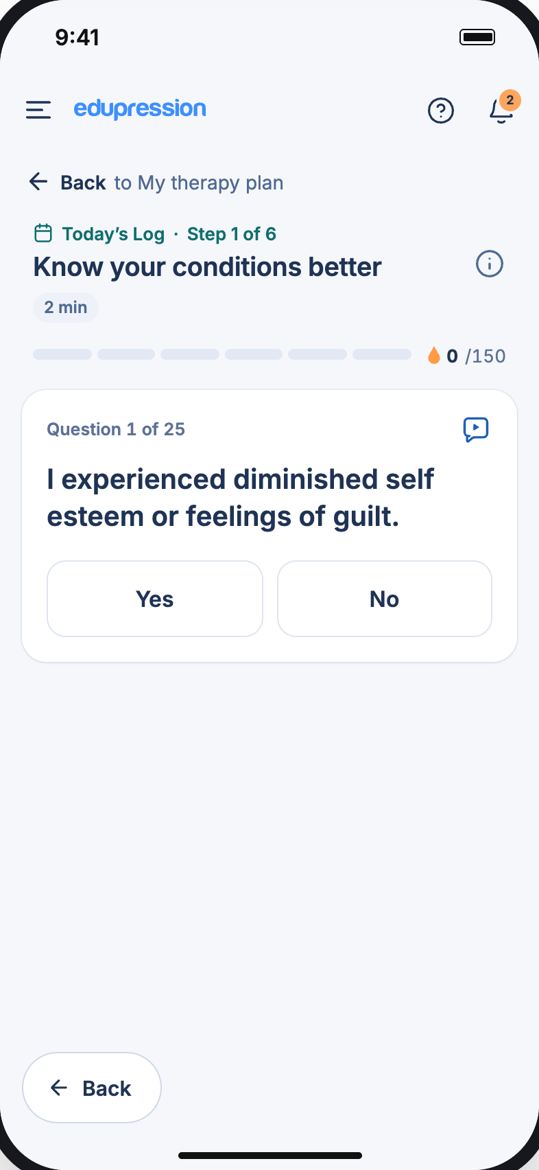
Question card
Question 1 of 25
I experienced diminished self-esteem.
Yes No
Next →
03Per theme
Theme tokens
Each token has a light and a dark value, both contrast-checked.
Light
Dark
InkLinkKickerHighlight
Now applied{{ themeLabel }}
04Always on
Safety layer
Shared notices, warnings and help routes any flow can call on.
{{ sf.n }}{{ sf.t }}
{{ sf.d }}
04 · How it connects

One plan, every task.

Every task starts from the same plan and comes back to it. Each one is built from the same shared parts: header, step count, question card, completion screen and drops.

01Daily log
25 questions · 1 min
02Therapy session
Short video
03Weekly goal
Pick one, track it
04Important information
Psychoeducation
05PHQ-9
9 questions · 3 min
06Consent
DiGA extension
05 · Exploration

Three directions. One winner.

Each concept was a clickable demo with the same real content, plus a toggle to flip back to the old interface for side-by-side reviews.

1a✓ Chosen
Quiet header
Title and theme as plain text, progress in six segments, content on white cards over a soft grey page. The least to read before the first tap.
1b
Week strip + timeline
Tasks, drops and booklets run along one vertical path with the next step expanded. Strong story, but more scrolling.
1d
Single tint, grid
A two-column grid of white tiles on soft blue. More above the fold, but busier, which works against the goal.
06 · How it connects

One system, every step.

Every flow, from prescription to progress, starts from the same design system. Tokens, components and the safety layer flow into each journey, so sign-up, daily tasks and care feel like one product.

edupressionDesign system
One source for every screen
AaTheme tokens
Colour, type, light & dark
Core components
Cards, questions, buttons
Safety layer
Notices, warnings, help
{{ jc.title }}
{{ st.n }}{{ st.label }}
Three journeys, one system. Steps advance in sync.
Chapter 01 · The daily plan

A plan you can actually finish.

The home screen is today, and only today: week and day, the unit’s theme, six tasks with honest time estimates, and a progress bar that fills one segment per task.

≡No bottom nav
Everything in the menu
▮6 segments
One per task
+Tap for drops
What earns them, and why
01
No bottom nav. Feed, My path, Library, reports and doctor live in the menu, so nothing competes with the plan.
02
Up next, always visible. The next open task is highlighted, so there’s no decision about where to start.
03
BDNF drops, explained. Tap the counter for a short sheet on what earns drops and why.
Chapter 02 · The daily log

A check-in, not a form.

25 questions, one per screen, with big answer targets and a visible count. Severity uses colour and words together, never colour alone. Sleep, life events, medication and a free note close the day.

1/25One question
per screen
+40BDNF drops
when it’s sent
01Yes / No
02Severity, in words and colour
03Completion
A/B/C test

The log describes the day, so it should open at the end of it.

Time of day
☀ Morning ☾ Evening
A
First in the list
The baseline. Easy to find, often filled in too early.
{{ abTime }}
My Therapy Plan
Daily log{{ ab1Tag }}
Therapy session
Weekly goal
Important information
PHQ-9
Consent
B
Docked “End of day” card
Quiet in the morning, the main action in the evening.
{{ abTime }}
My Therapy Plan
Therapy session
Weekly goal
Important information
PHQ-9
Consent
End of day{{ dockTag }}
{{ dockTitle }}
{{ dockBtn }}
C
Last in the list
Same evening timing as B, without a separate card.
{{ abTime }}
My Therapy Plan
Therapy session
Weekly goal
Important information
PHQ-9
Consent
Daily log{{ ab3Tag }}
Chapter 03 · Safety

When it matters most, the app slows down.

Two questions ask about thoughts of death or self-harm: question 12 of the daily log and question 9 of the PHQ-9. We designed them as moments, not rows.

Before
A calm notice above the question, with emergency contacts one tap away.
On “Yes”
A clear warning in plain words: talk to your practitioner, someone you trust or emergency services today.

Emergency help is also reachable from the header on every screen.

Chapter 04 · Motivation

Encouragement, without pressure.

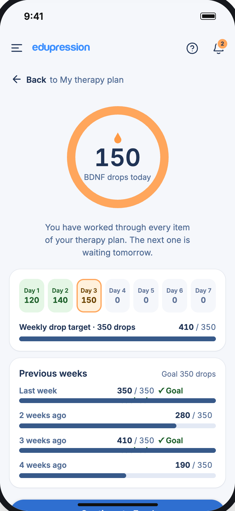
Each task earns BDNF drops, named after the growth factor the brain produces when active. A weekly target of 350 gives a goal; only active weeks are counted, so a hard week is never shown as a failure.

Chapter 05 · Continuity of care

Therapy that reaches the doctor.

Results become plain-language reports. Patients find their prescribing doctor by name or postcode, or invite a specialist to the practitioner portal; reports flow there once the practice accepts. Prescriptions go to the insurer from inside the app.

app.edupression.com/reports
My reports on desktop
01My doctor

Find the doctor once. Reports follow.

Search by name or postcode, include external directories, or invite a practice by email. Once it accepts, reports go to the practitioner portal automatically.

{{ dfl.label }}
Find your prescribing doctor
{{ docQ }}
Also search external directories
{{ dr.ini }}{{ dr.name }}
{{ dr.spec }}
{{ dr.btn }}
02Prescription service

From paper to access code, in the app.

{{ ro.t }}
{{ ro.d }}
{{ rs.n }}
{{ rs.t }}
✓Access code received
Enter it once, therapy starts
03Secure log-in

Health-grade security, no password wall.

Security key
Email + PIN
GesundheitsID
Login PIN from your email
{{ pb.d }}
✓PIN arrives by email
One-time, no password to remember
Chapter 06 · Light, dark, any screen

Built for late evenings.

The daily log opens in the evening, so dark mode wasn’t optional. Every token has a dark pair, and the same layouts expand into a sidebar on tablet and desktop.

app.edupression.com/plan
Therapy plan on desktop
Chapter 07 · Accessibility

Audited, screen by screen.

An automated scan of every visible text node, accessible name and tap target, in light and dark, followed by a manual review. Every failure became a token, so the fix applies everywhere.

SCIssue → fixResult
1.4.3Link blue on dark surfaces → new link token per theme3.2 → 5.6
1.4.3Orange “Required” kicker → darker orange, light and dark pairs4.2 → AA
1.4.3“Start” on the Up next card in dark mode → on-ink text token1.8 → AA
2.4.7Removed outlines on inputs and buttons → global visible focus ringFixed
2.3.3Celebrations and pulses → respect reduced-motion settingsFixed
Under the hood · Tech stack

Built on tools a team can hire for.

Mainstream, well-supported technology, chosen so the manufacturer's own team can maintain it and the BSI auditors could review it without surprises. A request travels left to right: from the patient's phone to the EU data centre.

Clients01
Patient apps
iOS, Android and the web, from one design system
FlutteriOS and AndroidDartReactpatient web appTypeScript
Application02
Secure API
Therapy logic, prescriptions and reports
Node.jsREST APIsAudit loggingevery data accessGesundheitsIDfederated sign-in
Data03
Health records
Structured, exportable, interoperable
PostgreSQLencrypted at restHL7 FHIRstandard exports
Infrastructure04
EU hosting
Data stays in the European Union
AWS Frankfurteu-central-1Dockerreproducible builds
Security layerAcross every layer, built to BSI TR-03161
TLS 1.3in transitEncryptionat restTwo-factorsign-inPenetration testedbefore listingGesundheitsIDsign-in to TR-03161
11months
from first sprint to going live
15people
across design, engineering and QA
10kpatients
have used the app
2weeks
per sprint, with demos for the clinical team
What we took away
01
Remove before you add.
Taking out the bottom nav did more for focus than any new feature.
02
Timing is part of the design.
When a task opens matters as much as how it looks.
03
Care doesn’t end at the screen.
Reports, doctors and prescriptions are part of the therapy too.