MSBUDDY: case study of a prescribable companion app for multiple sclerosis
A personal companion for people living with multiple sclerosis. Track symptoms, train the body, and bring real progress to every doctor's visit.


Prescribed,
trusted, personal.
What a prescribable companion for MS has to prove before a neurologist recommends it, and what the design had to carry.
A digital therapy specialists can prescribe, with costs covered by health insurance.
People start with a free, limited version and unlock the full programme with a DiGA code from their insurer. The design makes both paths feel complete.
Developed with the people who live with MS and the people who treat it, and examined in a clinical study.
- Development and operationrewoso
- In cooperation withOST · Kliniken Valens
- PlatformsiOS · Android
One companion,
every day with MS.
MS Buddy is a DiGA: a digital companion for multiple sclerosis that specialists prescribe and health insurers pay for.
We designed the full journey, from the first question to the monthly report for the care team, so the daily part fits into a few calm minutes.
The challenge
MS shows up differently in every body and on every day. Fatigue, pain, bladder problems and mobility change from week to week, and most of it happens between appointments, where nobody writes it down.
The app had to collect that daily picture without feeling like homework, and stay usable for someone who is tired, in pain or using a wheelchair.
- Energy and fatigue
- Pain and bladder
- Mobility and hands
- Five fixed tabs
- Validated questionnaires
- DiGA requirements
 What we delivered
How we helped
We designed the complete product on one design system: a single primary colour, a friendly mascot called Buddy, and five tabs that never move.
Every flow reuses the same cards, scales and status colours, so a new tracker or training slots in without a new pattern.
- Tailored onboarding
- Prescription flow
- Nine tracker scales
- Goals with status colours
- Guided trainings
- Weekly energy calendar
- Diaries and highlights
- Monthly reports
What the design delivered.
A complete, clickable product: every patient screen and every inner state, from first launch to the monthly report a neurologist reads.


18 flows, every state, end to end
tracker scales, from percentage and yes/no to a colour-coded VAS
steps in the guided tour, so nobody is left guessing on day one
goal states (active, inactive, completed), each with its own colour
tabs in one bottom bar, with a single purple active state everywhere
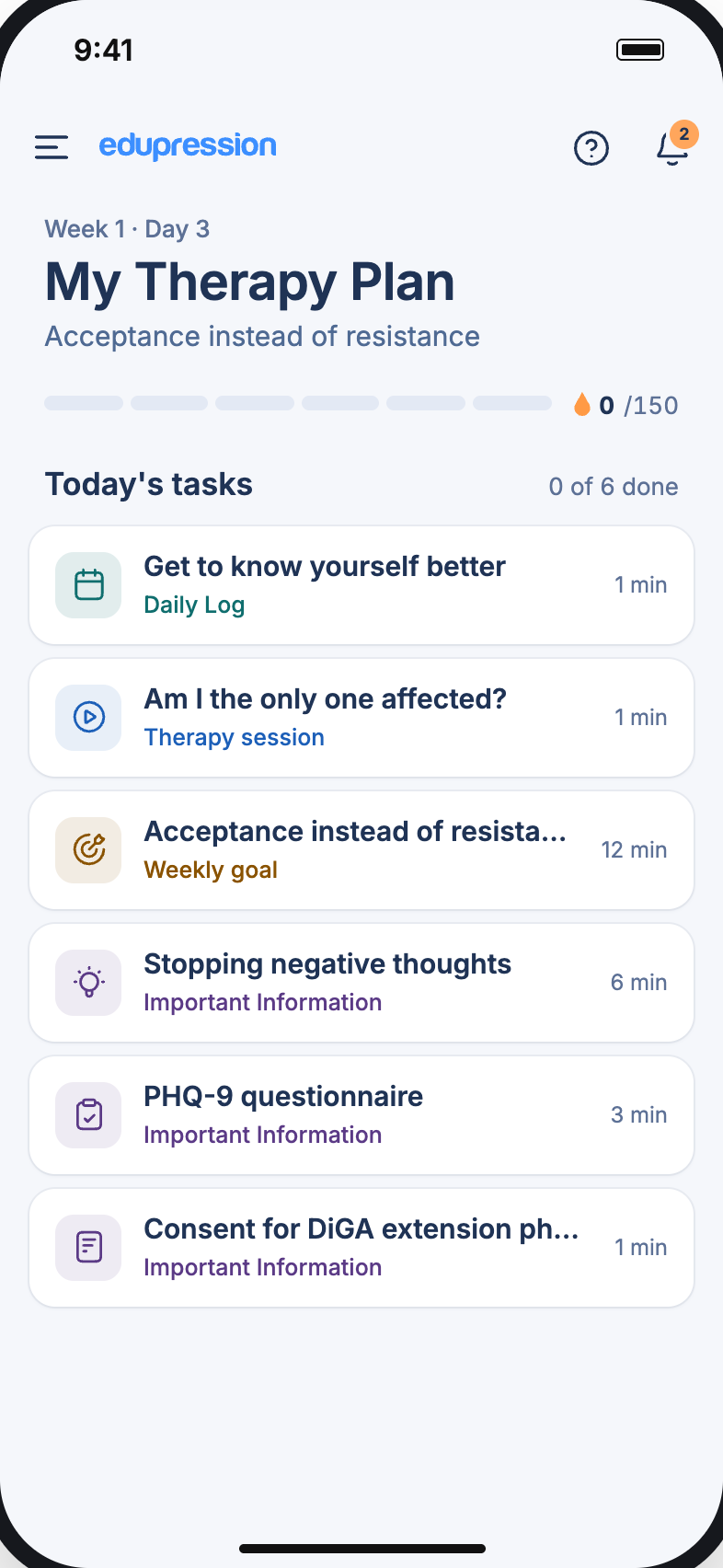
Planned around energy, not the clock.
The day starts with a plan coloured by energy level, a reminder nudges a short exercise snack, training adapts as it runs, and the evening closes with a mood check.

 Continue your exercise snacks?34m ago
Four shared layers.
One calm companion.
One navigation
Goals, Trackers, Feed, Interventions and More. Five tabs, always in the same place, one purple active state.
How are you feeling?


Core components
Hexagon mood faces, sliders, cards and timers are built once and reused by every flow.
How are you feeling?
OkayOne tap logs the mood
Status colours
Purple means active, red inactive, green completed, orange a break. The same meaning on every screen.
Guidance layer
Buddy, the hexagon mascot, explains features, fills empty states and celebrates finished trainings.
Welcome to MS Buddy1 / 10A first-hand look at what the app offers you.
One feed,
every entry.
Every tracker, training, mood and diary entry lands on the feed as a honeycomb tile. A day of living with MS reads at a glance, and every tile opens its details.
Your journey,
on one page.
Right after setup, and before the Feed opens, one page maps the whole programme as a loop of six steps. Each step became a chapter of the app, and three of them wait for a prescription.
Capture your symptoms
Set your goals
Configure interventions
Track your progress
Capture again
Assess and report
The same map, before and after a code.
Locked steps stay on the page with a lock, so people see the whole programme from day one. A DiGA code opens every step, and "Get started" leads into the Feed.
Get started→Opens the Feed, with every unlocked step one tap away


One system,
every step.
Getting started, daily care and staying on track are three journeys built from the same parts, so a person learns the app once.
Getting started

Daily care
Staying on track
Three journeys, one system. Steps advance in sync.
Set up in minutes, tailored from the first answer.
Clear consent, sign-in with email or GesundheitsID, then a short guided setup. Symptoms open into plain-language explanations, and a mobility slider adapts trainings for walking aids or a wheelchair.
- 1Welcome
- 2Consent
- 3Sign in
- 4Symptoms
- 5Mobility

Consent, one choice at a time

Symptoms explained, not just listed


Mobility shapes every training
Six digits, three honest states.
Empty, wrong and right each look different, and the resend timer tells people exactly when to try again.
Please enter your OTP
“I am your MS buddy.”
The first screens introduce a companion, not a medical tool, then say who built it and which clinics took part.
- 1Welcome“I am your MS buddy”
- 2Via the appBuilt with MS experts and clinics
- 3Account createdA confirmation link is on its way


From a doctor's code to the full therapy.
People who already have a code redeem it in one step. Everyone else sees what they are missing, how to get a prescription, and can still start with a free limited version.
Do you already have an activation code?
- 1
- 2
- 3


Two plans, one honest comparison.
“Understand your MS” needs no prescription. The Digital Therapy Plan adds personalised therapy, covered by health insurance.
- No prescription needed
- Covered by insurance
- Renewal shown in-app

Show the value before asking for a code.
Locked features stay visible behind a small lock, so the free version feels like a preview of the real programme.
- Training videos
- Outdoor activities
- Limited mode to start


Any symptom,
on its own scale.
Steps, sleep, stress and mood come ready to use. Anything else can be built in seconds from nine scale types, and any two trackers can be compared on one chart.

Active trackers, a week at a glance


Compare steps with sleep or mood
A VAS scale that reads like a feeling
Nine scales. Pick one, see it.
Share of a daily target, from 0 to 100%
Each scale draws its own week, so a yes/no tracker never pretends to be a percentage.
Goals that show their own status.
Every goal card carries a colour bar, this week against last week, and a link to the tracker behind it. Finished goals turn green, so success is visible from across the room.


Training that
listens to the body.
Interventions are scheduled on a timeline, trainings play as video with sets and breaks, and every session ends with two questions. If it felt too easy, MS Buddy suggests harder exercises next time.
A timeline for today

Sets, breaks, done


Too easy? Go harder.
Thirty seconds, from a notification.
A reminder opens straight into a short exercise with its own timer and videos. Nothing else to navigate.
- 30 second goal
- Timer and 3 videos
- Opens from a reminder
Continue your exercise snacks?Open the app to stay on track.34m ago


People choose the days, the time and the order.
Weekdays, a start time, and exercises that can be reordered or swiped away. Then pick a playlist and start.
- Pick weekdays
- Set a start time
- Reorder or swipe away
- Playlists

Energy, planned
by the hour.
After each activity people rate how it felt: feeling low, calm or energetic. The weekly calendar turns those ratings into a map of good and hard hours, so the next week can be planned around them.
How did it feel?
3energetic activities this week, all before 13:00

The moments the numbers miss.
A title, a few lines and photos. Good days can be pinned as highlights, and any entry is one date away.
- Write freelyTitle, text and photos
- HighlightsPin the days worth keeping
- Photos to 10 MBStraight from the phone
- Find any dayA date in two taps


A month of progress,
in one report.
Patients generate a monthly report in the app: goals, trackers, activities and adherence, laid out for a neurologist to read in minutes and shared before the appointment.
Lara MaierMonthly report · March- TrackersDaily averages
- GoalsStatus and progress
- ActivitiesDuration vs plan
- CalendarPerformed or missed


Reminders from the app, prompts from the MS nurse.
Each kind has its own colour and tag, so a suggested appointment never gets lost between exercise reminders. Archive or swipe to delete.


Questionnaires in plain words.
One question group at a time, with scales, choices and space to describe.

Seven days, rated in one sheet.
Completed units, the training load and how the week felt.

A trusted person, one tap away.
Profile, reports, help and feedback, plus a person of trust who can follow along.
Buddy shows
the way, one step
at a time.
A nine-step tour points at each part of the app in turn, a highlighted icon and a short card each time, with Skip always one tap away.
Skip any timeThe tour never blocks the app 01WelcomeA first-hand look at everything MS Buddy offers.
 02Your feedMoods, daily entries and activities in one place.
 03Help centerHelp, FAQs and a line to the support team.
 04NotificationsA red dot means something is still unread.
 05Weekly calendarWeekly and daily views of every activity.
 06GoalsCreate, manage and track personal goals.
 07TrackersLog daily activities and wellbeing.
 08InterventionsStructured activities that support progress.
 09MoreProfile, reports, a trusted person and help.
One system,
built to be calm.
A purple scale and four status colours with fixed meanings, Manrope for words and Inter for numbers, Vuesax line icons, and Material UI components restyled with MS Buddy tokens.
Built on tools
a team can hire for.
Mainstream, well-supported technology that the manufacturer's own team can maintain and auditors can review without surprises. A request travels left to right: from the patient's phone to the EU data centre.
Patient apps
iOS and Android, from one design system
Secure API
Trackers, goals, prescriptions and reports
Health records
Structured, exportable, interoperable
EU hosting
Data stays in the European Union
Design for the hard days.
Big targets, short sessions and a mobility setting mean the app still works when energy is at its lowest.
One meaning per colour.
Purple is active, green is done, orange is rest. People stop reading labels and start reading the screen.
Care continues after the app.
Reports, prescriptions and a trusted person are part of the therapy, so they got the same care as the screens.