01
The problemOne login, three kinds of people
The design answer
Decision · Accounts→Three doors on one sign-in page: Site, Company and User Details.
A white-label quality and compliance platform. CarePlus runs it under its own name across every pharmacy site, from head office down to each person on shift.
QI-Tech is the company and the platform. CarePlus is the customer running it, so every screen had to wear someone else's name without losing its own logic.
Each customer gets its own logo, colours, sign-in page and site themes. The product underneath stays the same, with a quiet "Powered by QI-Tech" at the foot of the sign-in page.
 The platform
 The customer brand
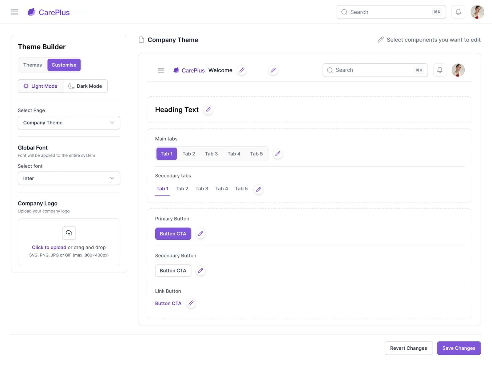
Theme builder. Head office picks the logo, primary and secondary colours, tabs and buttons, and sees them on a live preview before anything goes out to the sites.
QI-Tech helps multi-site healthcare businesses report incidents, run audits and root cause analyses, and keep forms and tasks on schedule.
We designed the full platform around three kinds of account, so head office, each site and every person on shift sees exactly the part they need.
A pharmacy group juggles incidents, controlled-drug checks, fridge logs, audits and training across dozens of sites. Head office needs the whole picture, a pharmacist at the counter needs to log an error in seconds, and every customer wants the system to look like their own.
One rigid tool for everyone meant too much for the counter and too little for head office.
We designed one product with three doors: a company account for head office, a site account for each regional site such as a pharmacy, and a user account for every person at that site.
All three share the same components, status colours and layouts, and every brand decision lives in themes, so a new customer is a configuration, not a redesign.
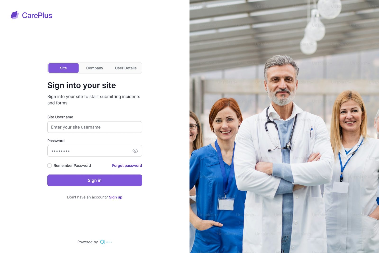
The same CarePlus sign-in page opens three different products. A tab picks the door, and everything behind it is shaped for that role.
Compliance and operations teams who look after every site at once.
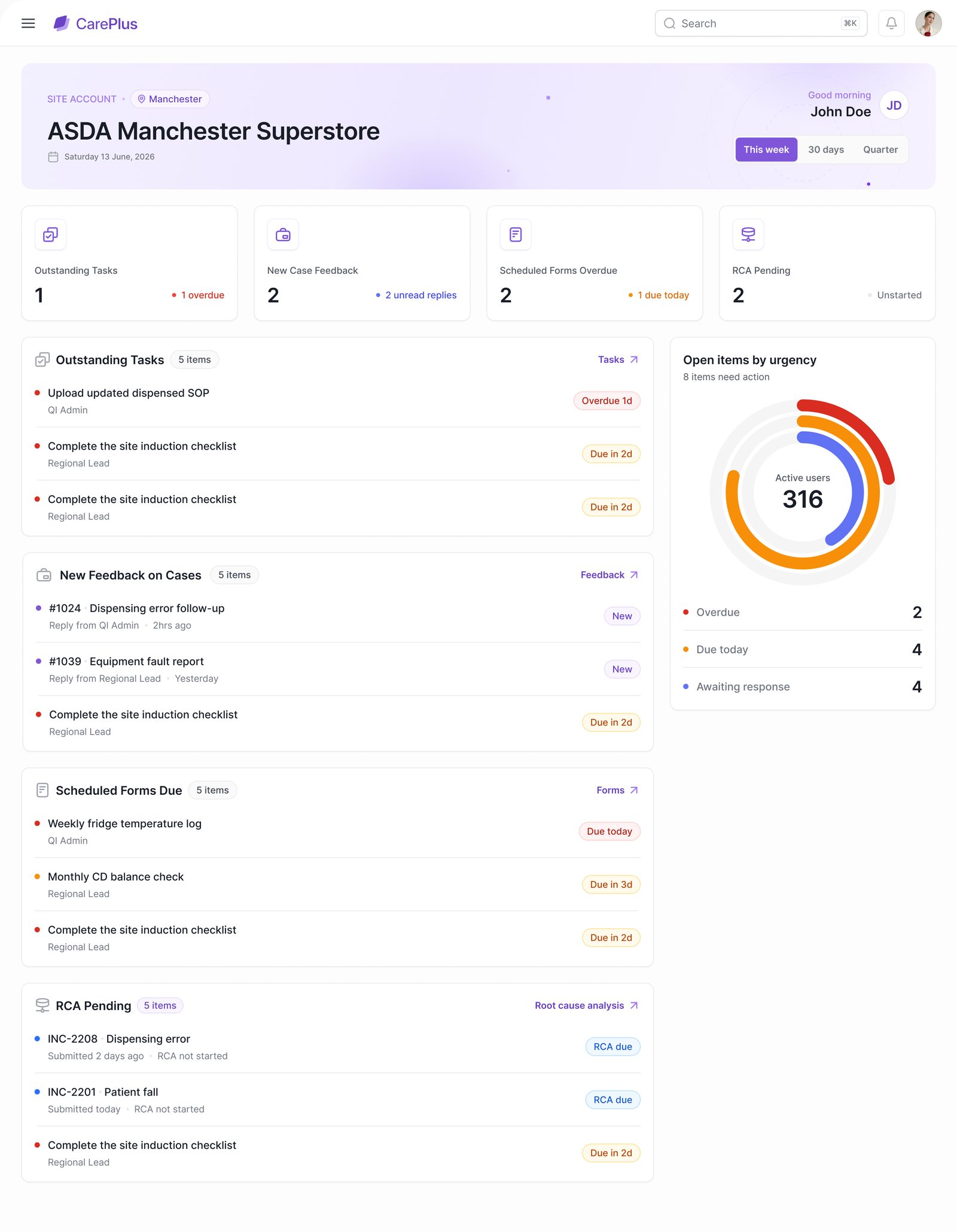
A regional site such as a pharmacy, signed in on a shared device at the counter.
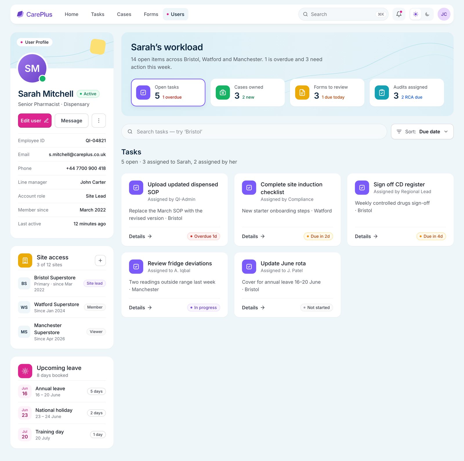
Each member of staff at a site, from a pharmacist to a new starter.
Site, Company and User Details sit side by side on the CarePlus sign-in page, so nobody hunts for the right link, and each tab explains what it opens.
A shared device at the counter, for everyone on shift.
A complete web product for all three accounts, every module and inner state, from site creation to the RCA an outside investigator opens by email.
Three accounts, nine modules, every state
Before drawing screens, we walked through a day at a pharmacy group and listed every point where reporting slowed down or broke. Each one became a design decision.
Three doors on one sign-in page: Site, Company and User Details.
Pick your face, then a 4-digit PIN. No passwords on a shared device.
Every incident becomes a case that follows a workflow head office designs.
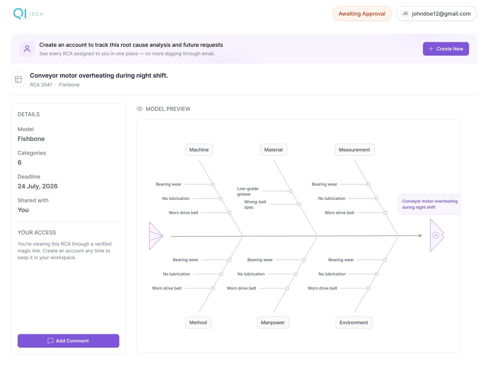
Fishbone and 5 Whys templates, sent to sites or outside investigators.
A theme builder for the platform, the sign-in page and each site.
One product that three kinds of people use every day.
Can six people share one tablet without sharing one password?
→ Face + PINWhat has to change for a new customer, and what must never change?
→ Brand tokens vs status coloursHow does an outside investigator open an RCA without an account?
→ Email code, read-only viewWhat does head office need to see before the first click?
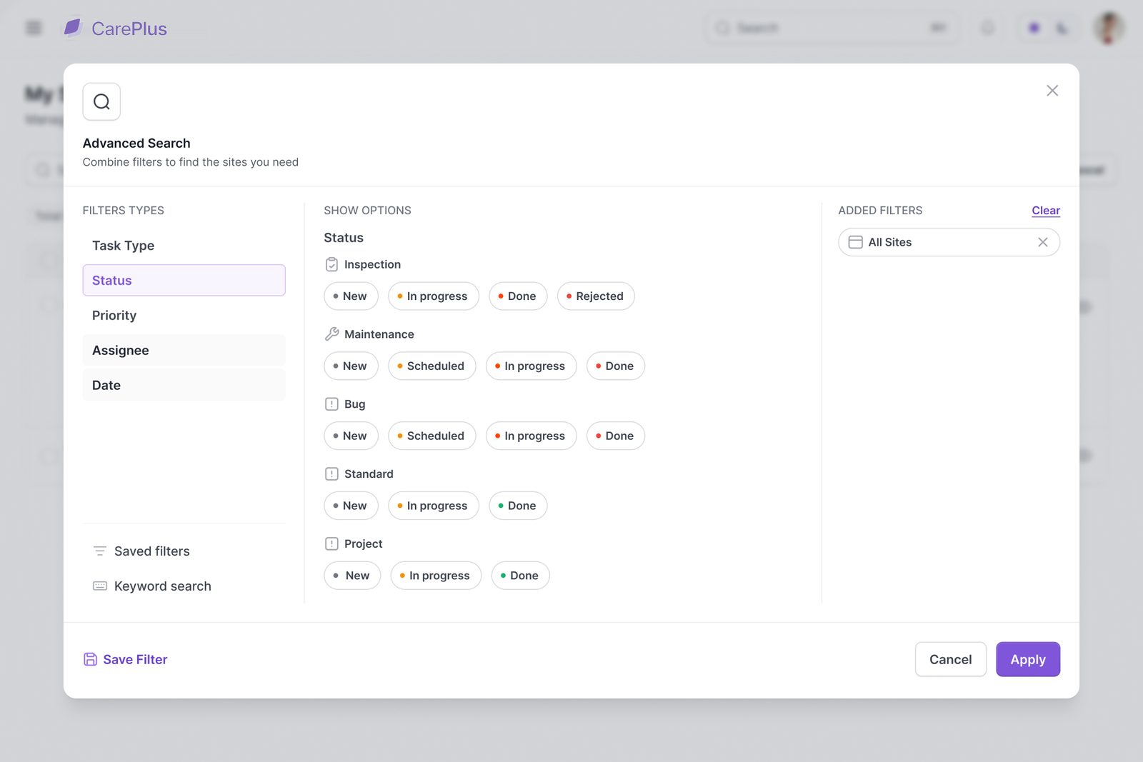
→ Four KPIs, four listsHow do you move a site to another company without losing its open cases?
→ Transfer with access tokensImports bring duplicates. Who decides which record wins?
→ Confidence score, merge per fieldHead office adds a pharmacy in one guided flow. Two real decisions, what kind of site and when it goes live, and the product handles the rest.
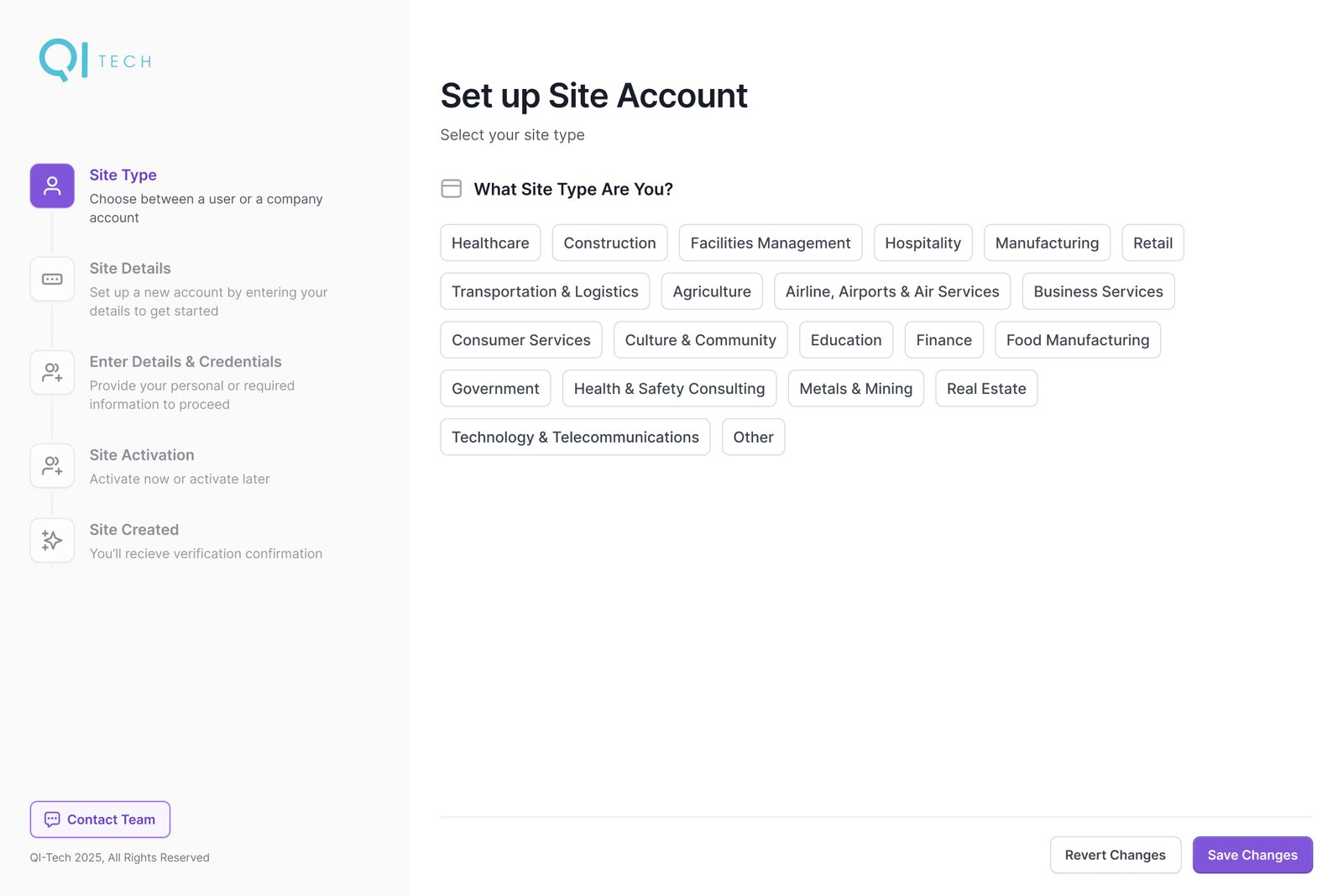
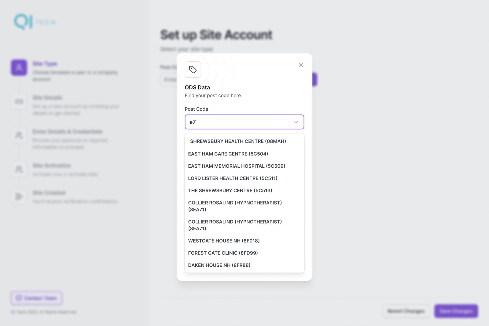
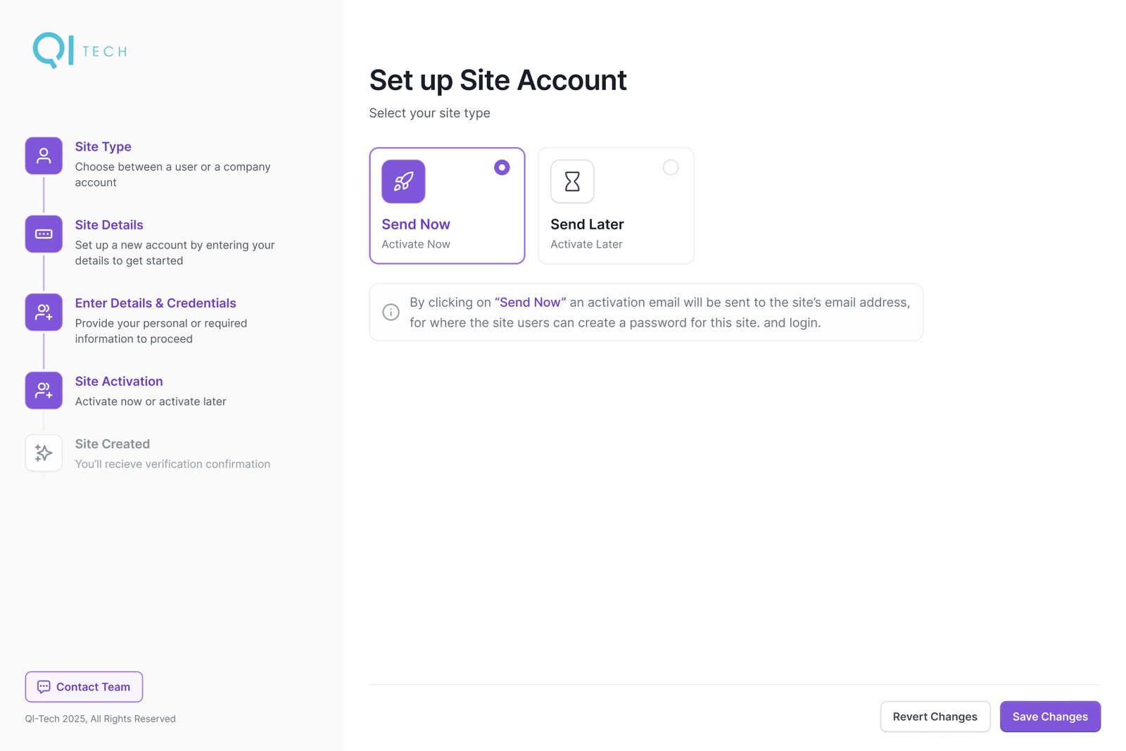
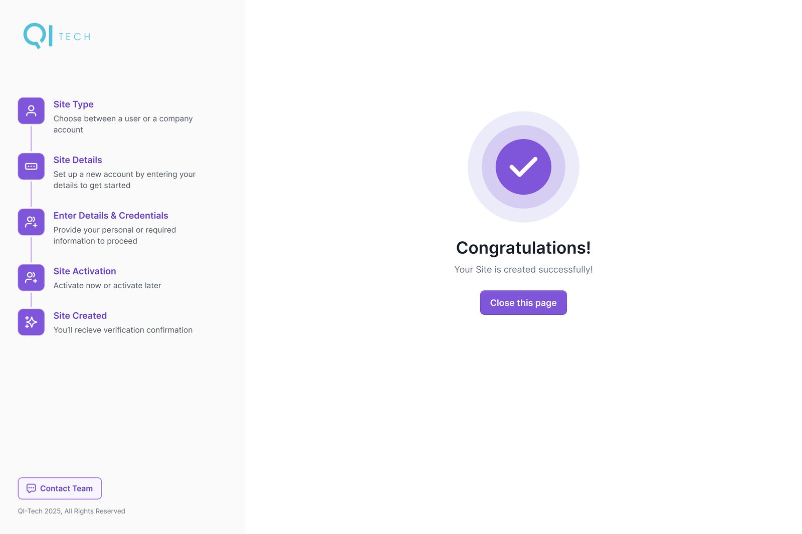
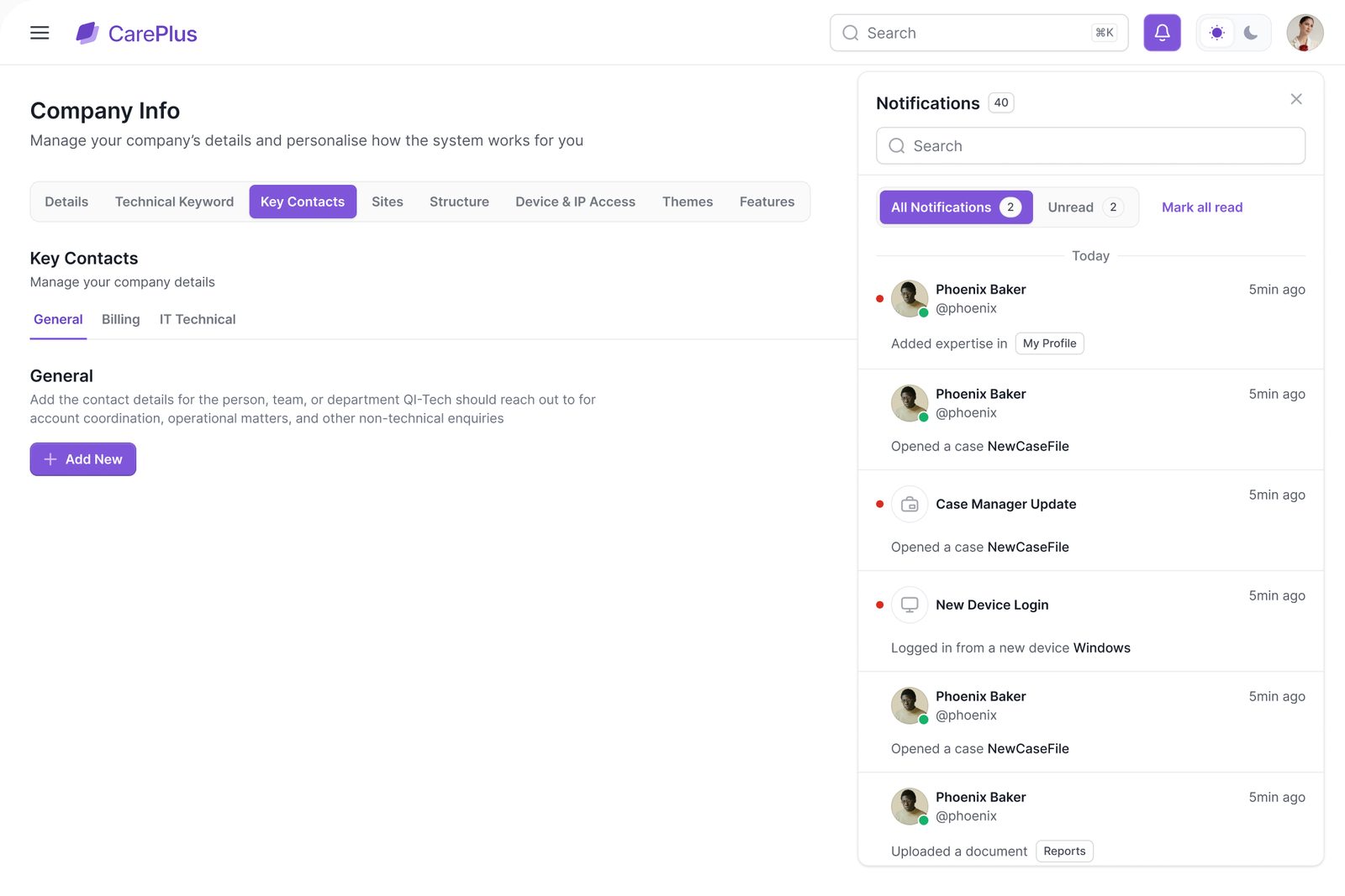
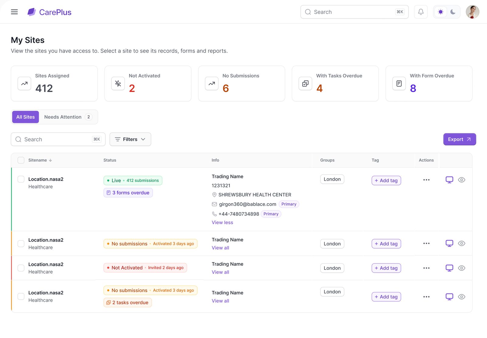 Chapter 01 / 04 · Company account
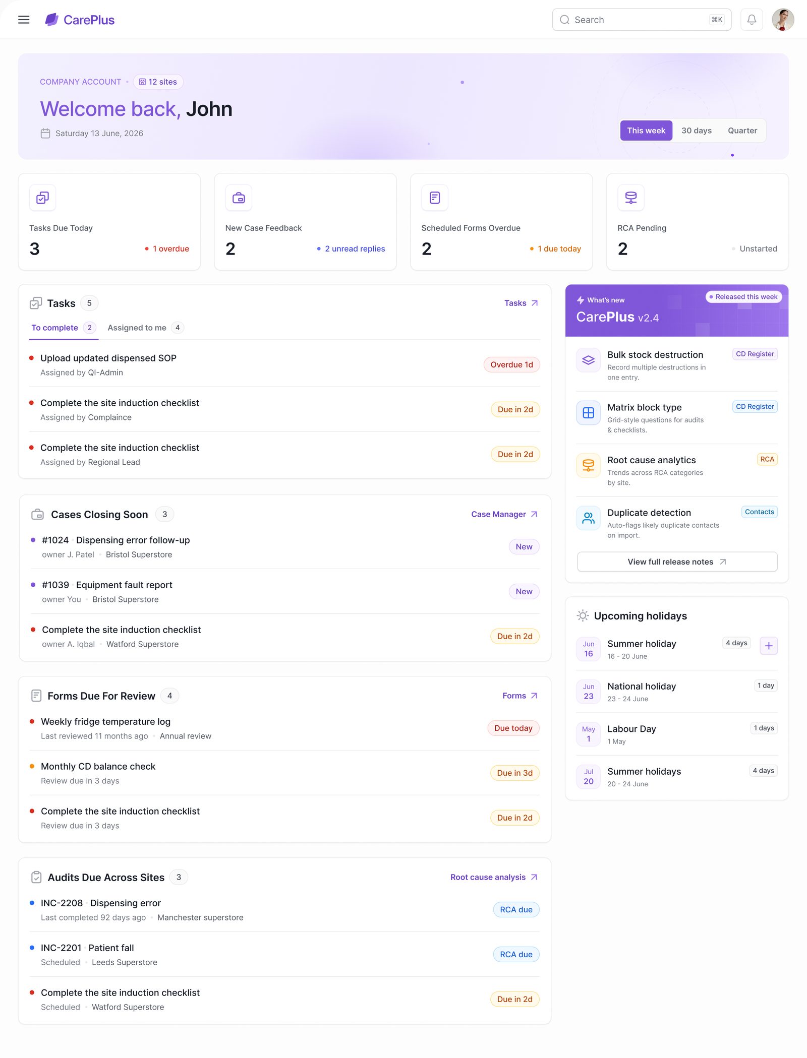
Head office used to open five tools to find out what was late. Home now answers it in one screen: four numbers, four lists and what changed in the latest release.
 Chapter 02 / 04 · Cases & RCA
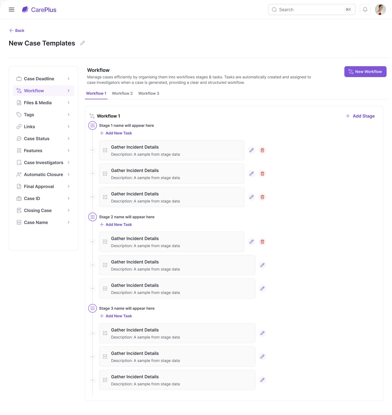
Incidents used to end with a name. We mapped the journey from report to closure first, then designed each step so the case moves toward a cause and an action.
Each case type gets its own template: the stages a case moves through, the tasks inside each stage and who acts on them.
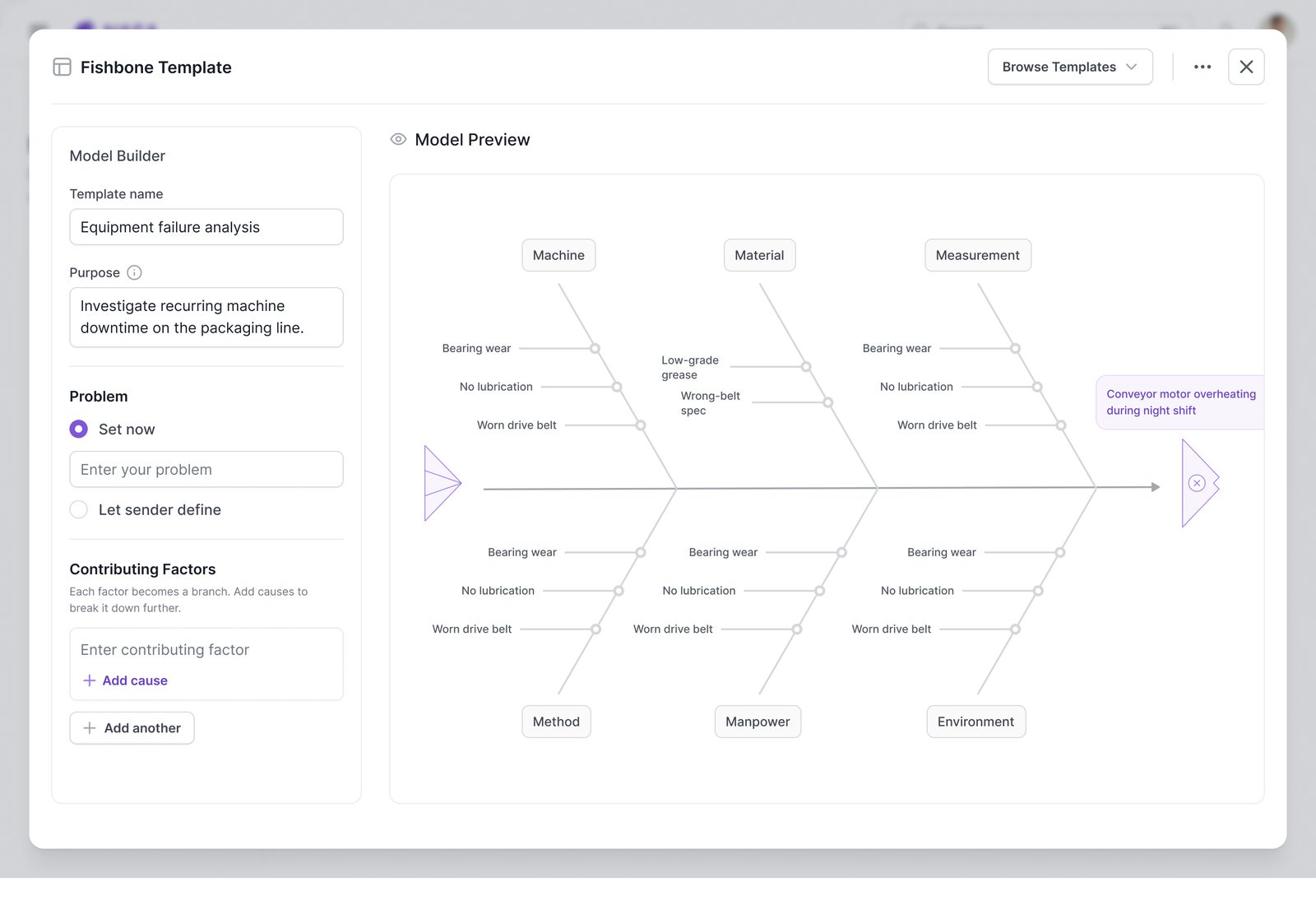
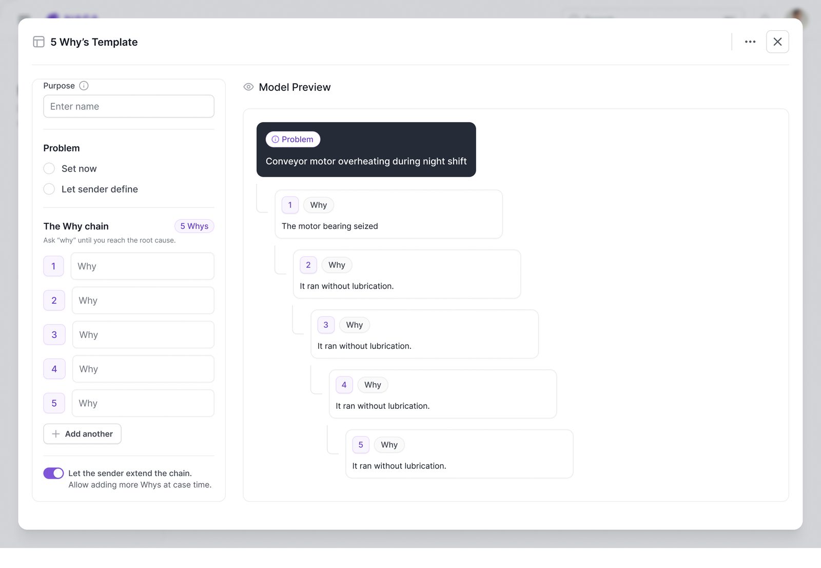
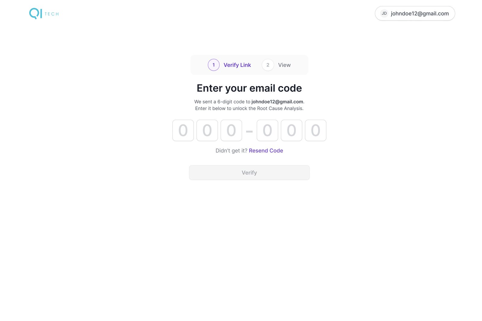
Some RCAs go to people outside the company. They get an email, enter a six-digit code and land on a read-only view of the RCA, with nothing else of the platform exposed.
 Chapter 03 / 04 · Work & numbers
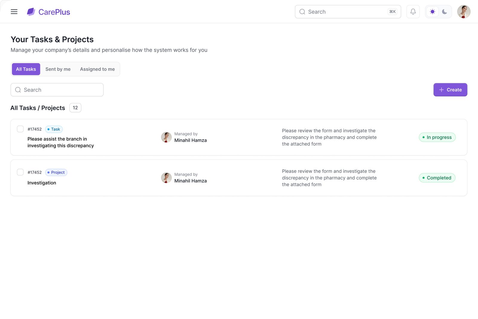
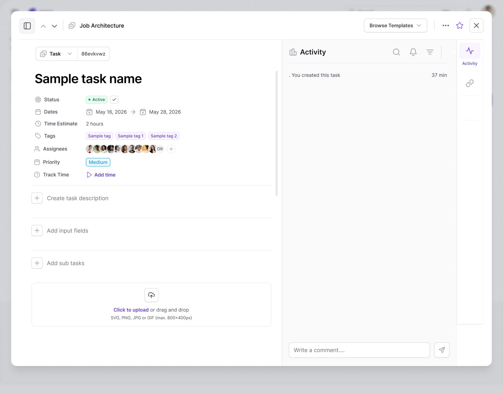
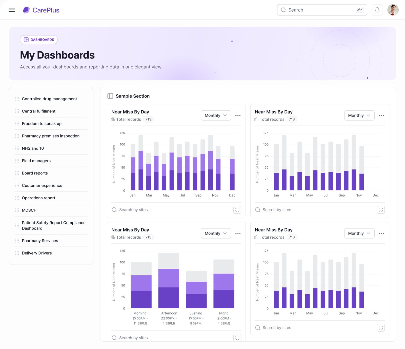
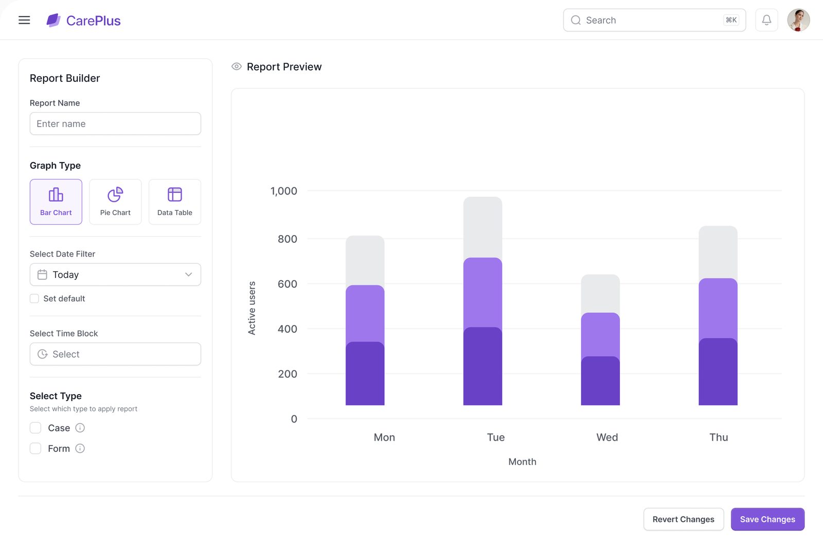
One board for every task and project, and reports that arrive on a schedule instead of being rebuilt in a spreadsheet every month.
 Chapter 04 / 04 · White-label
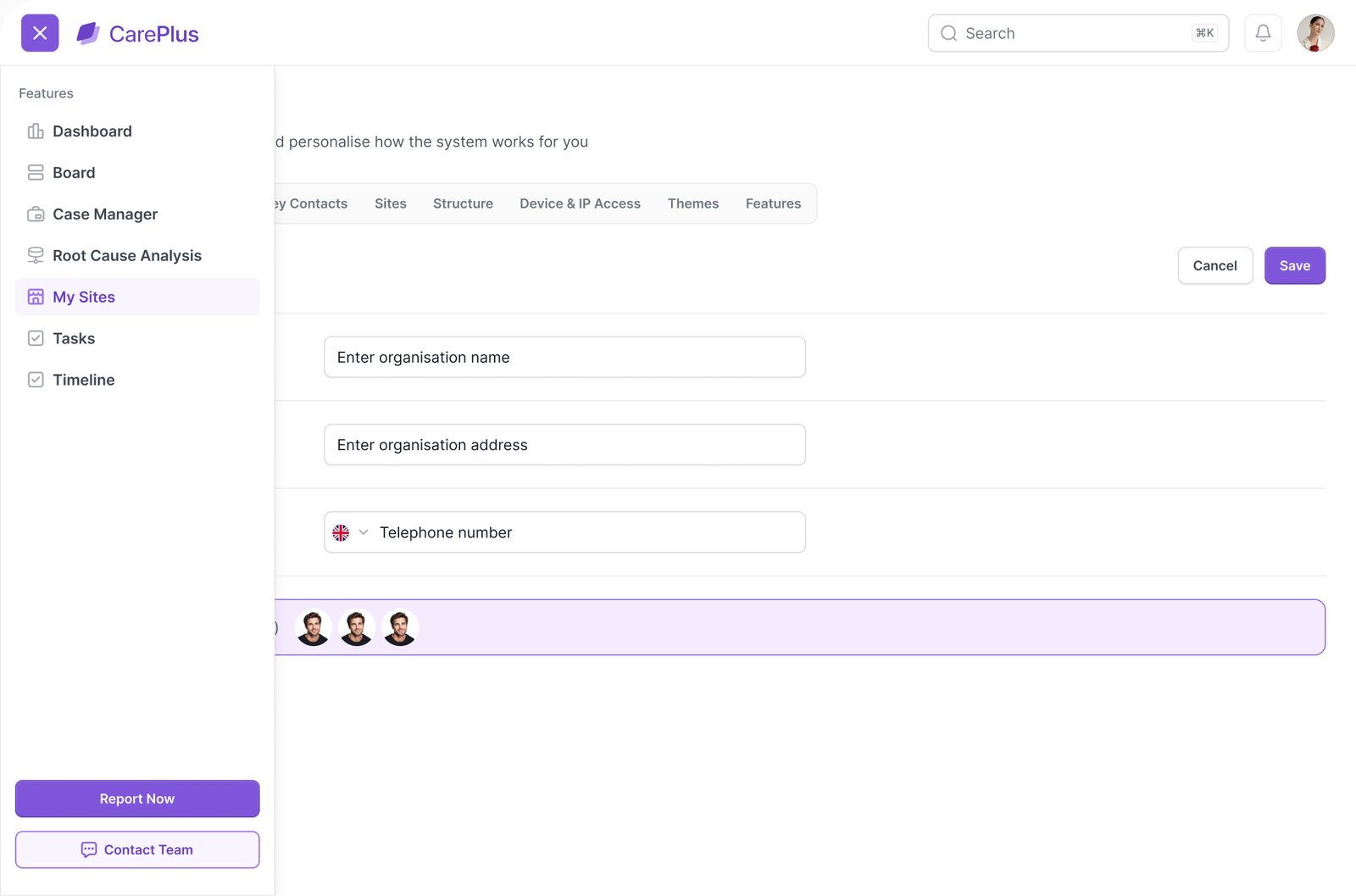
A customer's brand lives in three layers: the company theme, its sign-in page and an optional theme per site. Each one is edited on a live preview, so nothing goes out untested.
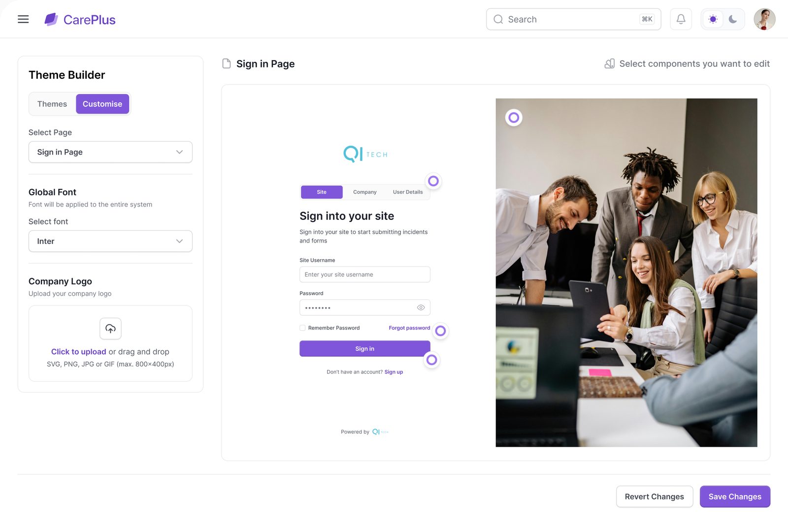
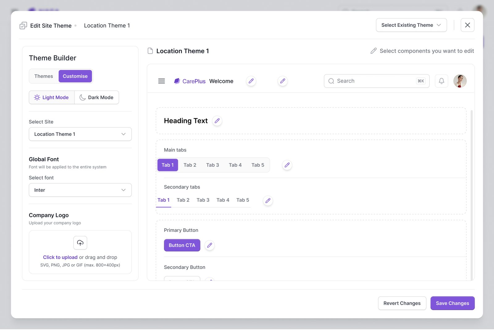
Pick a brand. The logo, tabs, buttons and highlights follow it. Status colours never move, so overdue still reads red whoever is on top.
Example brands, for illustrationSmaller decisions outside the main flows that keep the data clean and the platform safe.
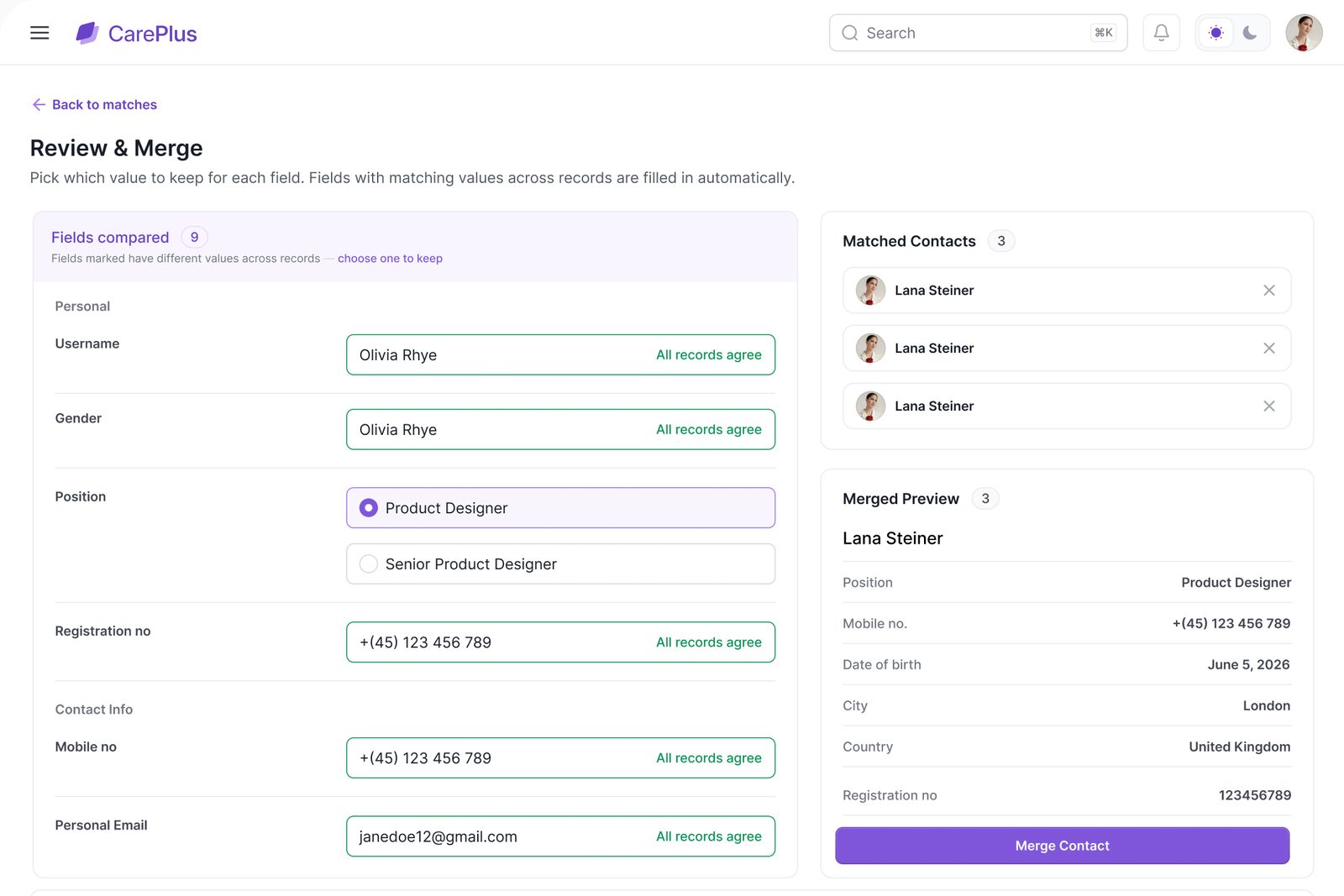
Imported contacts are matched with a confidence score. Review picks the value to keep for each field and previews the merged record.
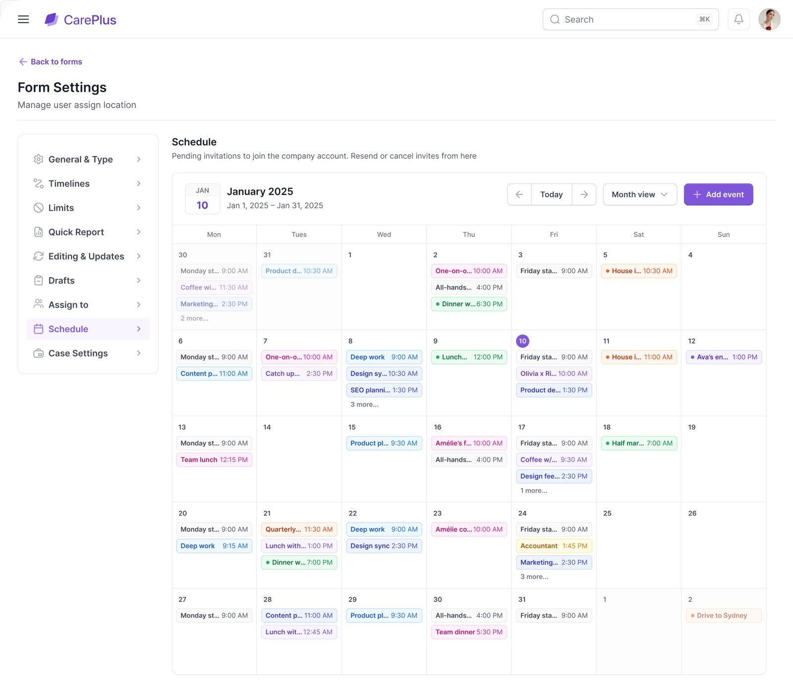
Forms are versioned and archived, then scheduled per site, so a fridge log or CD check is never a reminder in someone's head.
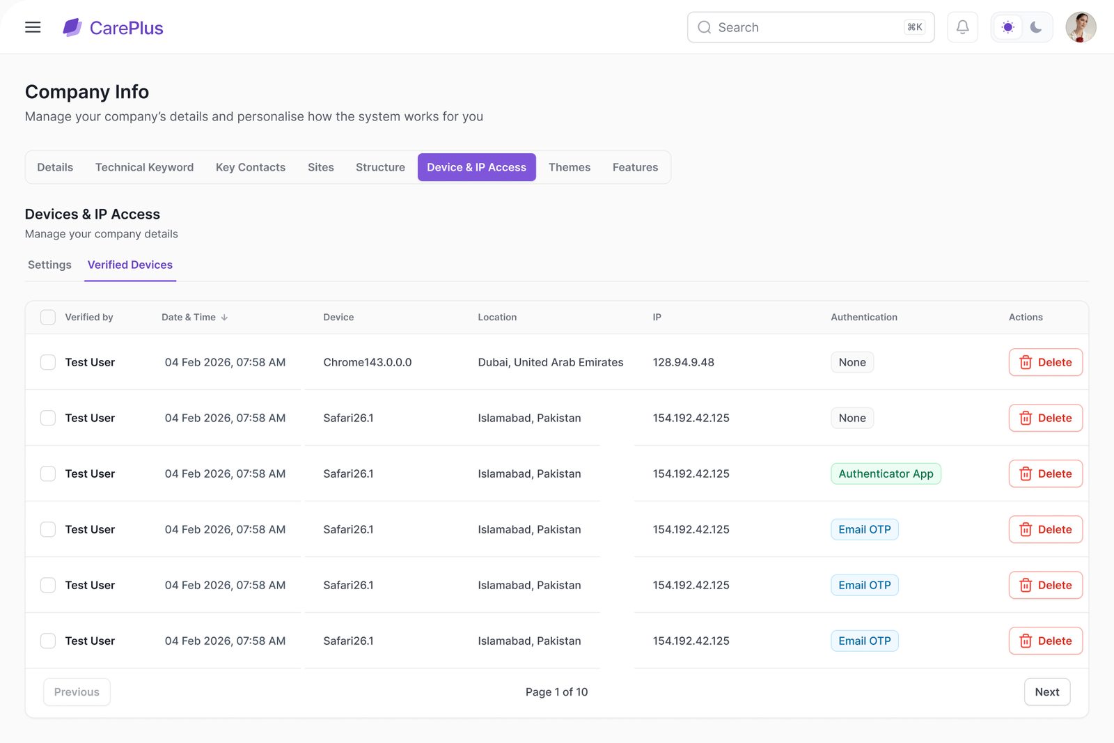
Verified devices, IP allow-lists and two-factor where it matters, all visible to head office in one table.
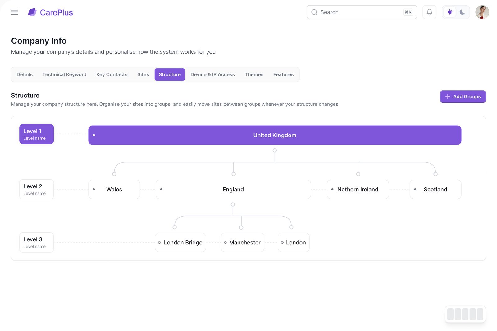
Countries, regions and groups in a visual tree, so reports and permissions follow how the company is actually run.
One shared device per site, many people using it. Signing in had to be quick, and the site's work had to be one tap away.
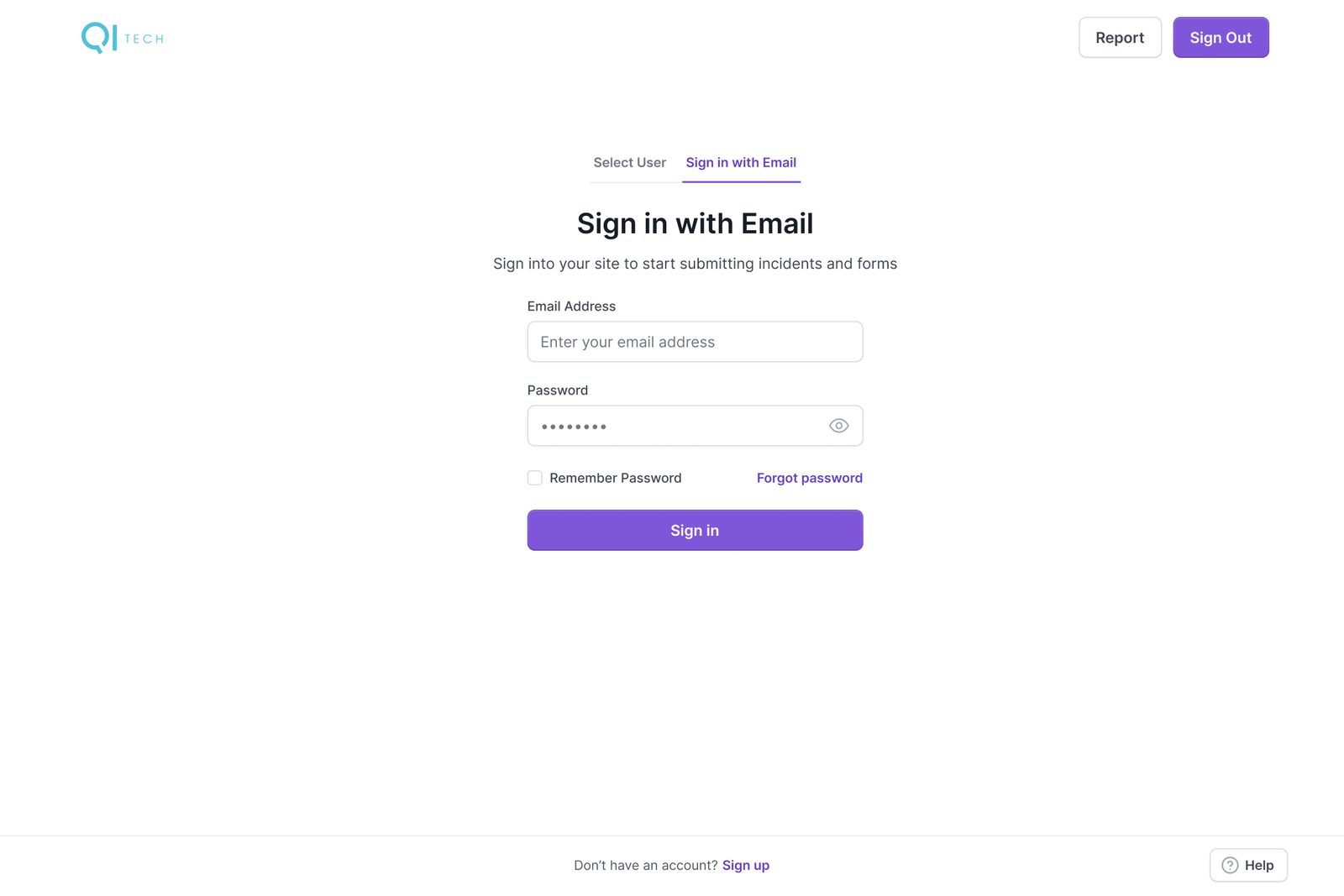
The site account signs in once on the shared device, on its own branded page.
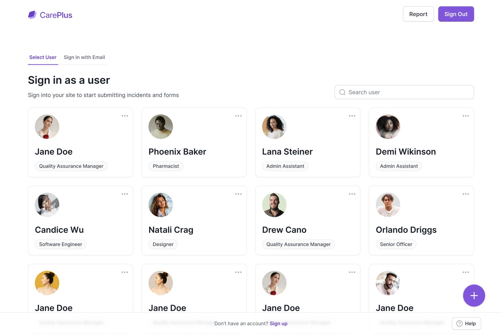
Everyone at the site appears as a photo and role, with search for bigger teams.
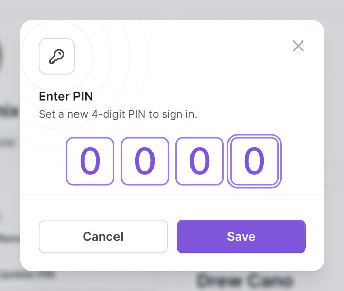
A 4-digit PIN signs you in, and a reset is two fields away if you forget it.
Outstanding tasks, new feedback on cases, scheduled forms and pending RCAs, with one ring that splits everything open by what needs doing first.
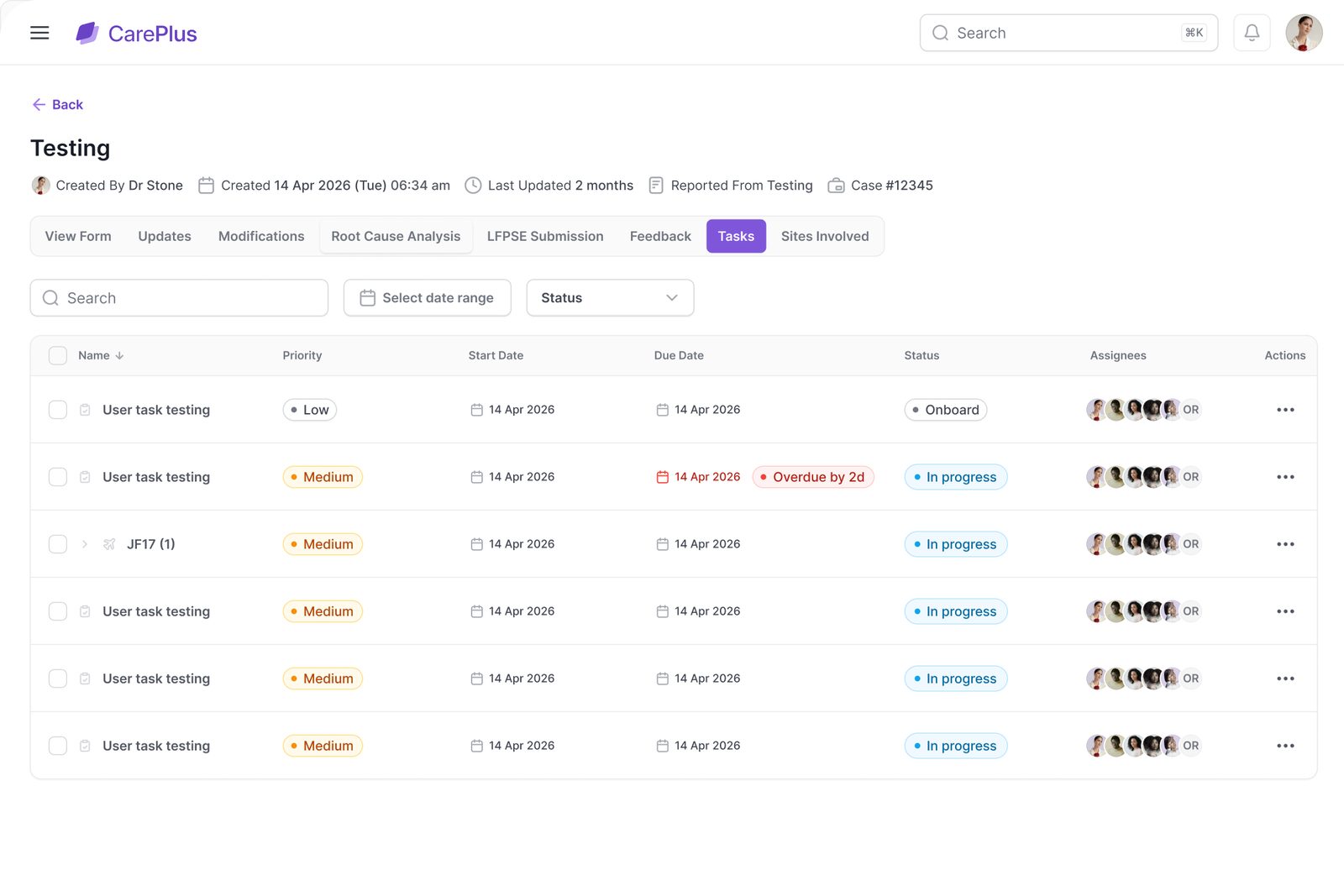
What the site owes head office, each with a priority, an owner and a due date.
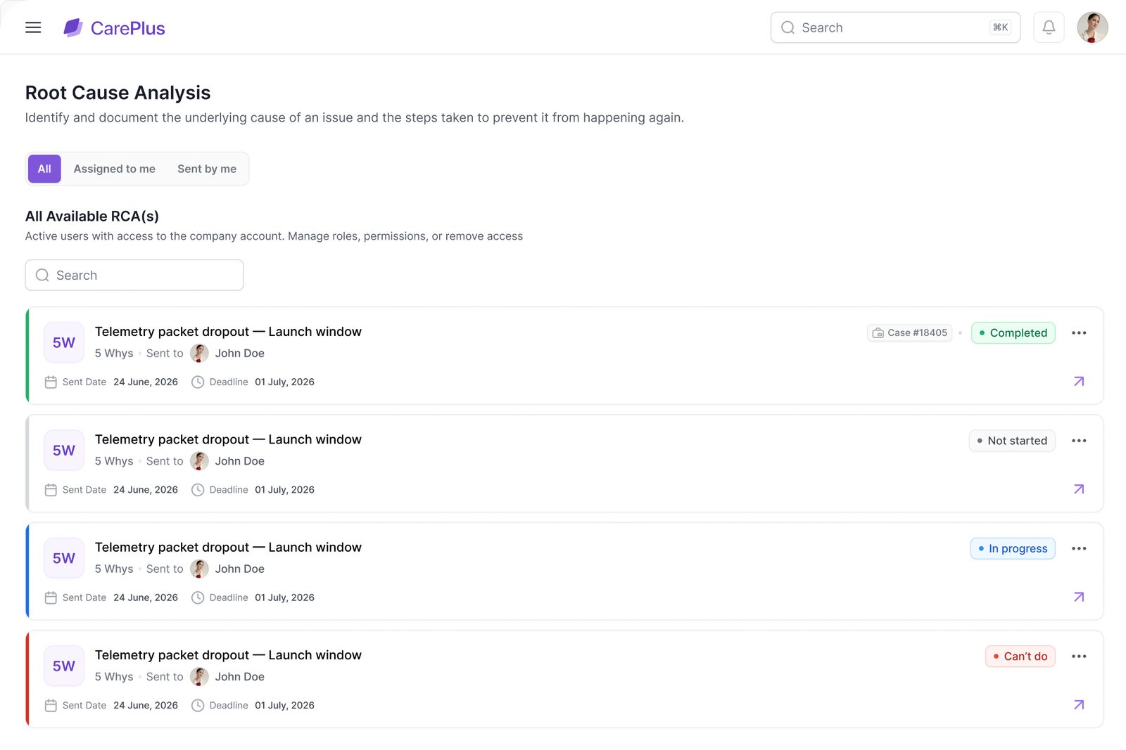
Root cause analyses assigned by head office and answered here with a Fishbone or 5 Whys.
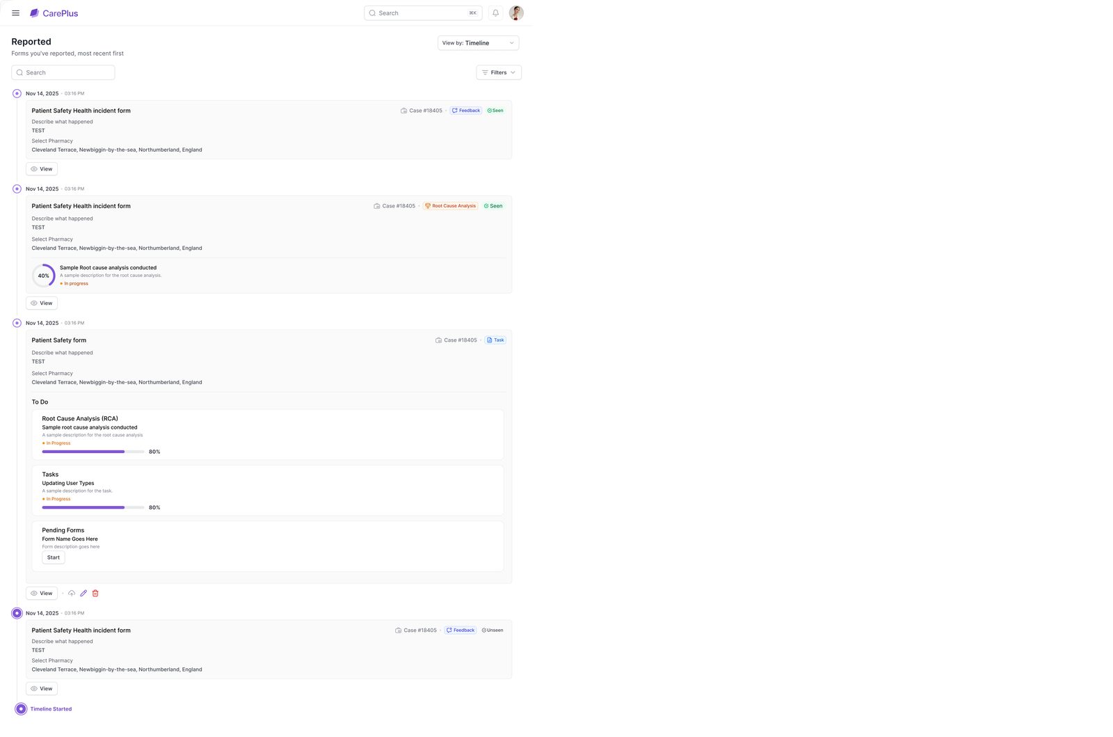
Every report and form the site has filed, newest first, in one running list.
Behind the PIN, each person sees their own workload across every site they belong to, and managers see the same page when they open a colleague.
Built on Untitled UI: a purple scale a customer can swap for its own, four status colours whose meaning never changes, Inter throughout and Untitled UI’s line icons.
Untitled UI ran through both sides of the project: its Figma kit for the design system and its React components for the build, so what we designed is what shipped.
The Figma library gave us tokens, components and page patterns. Untitled UI React, built on React Aria and Tailwind CSS, gave the developers the same components in code, themed per customer through CSS variables.
Every dashboard tile and report preview: stacked bars by site, rings by urgency and the live graph in the report builder.
The app framework for all three accounts, with shared layouts and routes.
Brand colours as CSS variables, so a new customer is a new theme, not new code.
Query for server state, Table for every list, filter and saved view.
With Zod validation for cases, sites, forms and every builder.
Every brand decision lives in a theme, so CarePlus is a configuration of QI-Tech, not a fork of it.
Company, site and user accounts share components and status colours, so moving between them never feels like a different product.
A face and a 4-digit PIN beat a password on a shared device, which is where most incidents are first reported.
More product case studies, plus a hand-picked selection of shorter projects.
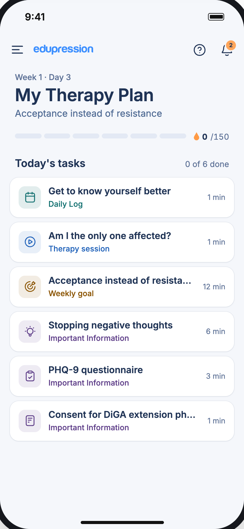
One calm daily plan, every patient.
One calm daily plan that helps people with depression finish their therapy, and keeps their doctor in the loop.
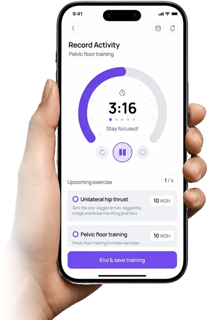
A companion for living with MS.
A companion app for people living with multiple sclerosis: guided exercise, energy budgeting and symptom tracking.
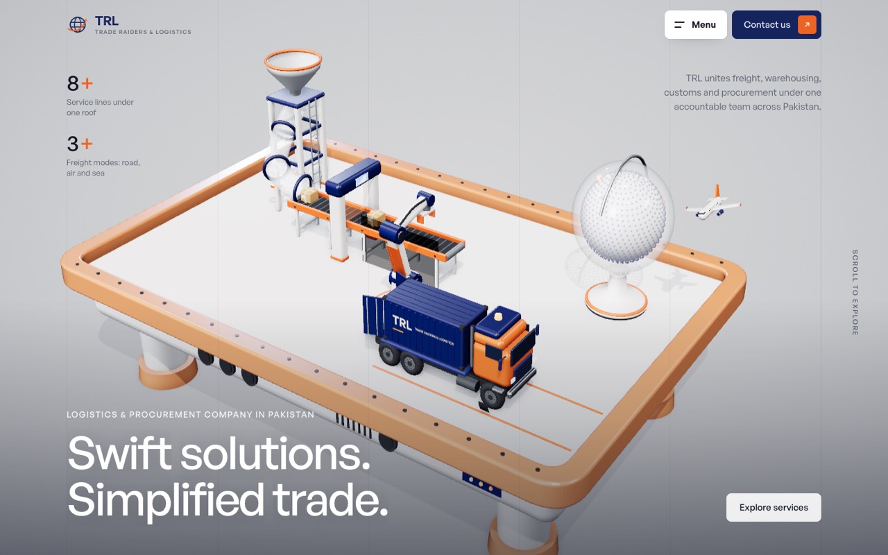
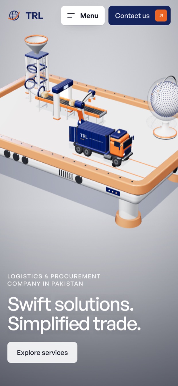
Swift solutions, simplified trade.
A logistics and procurement brand from Pakistan, rebuilt as a 3D website that shows how goods actually move: collected, cleared, stored and delivered.